✴︎ smooth landings, smoother UX: auditing airport app
CONTEXT
As part of my ongoing commitment to sharpening my UI/UX skills and staying connected with real-world product challenges, I often select existing products to audit and redesign. I chose the AirportLabs app for this self-initiated case study, focusing on improving the experience within a business-critical tool for a highly specific audience.
The Airport Labs app is not publicly accessible; it is used exclusively by airport stakeholders, including staff, ground handlers, and airline crew, to receive real-time updates on flights, incidents, and operational data while on the go. These users check flight statuses quickly, while in motion, under bright lighting, and often using one hand during their workflows.
Because this is a closed-access app, my audit was based primarily on the 3 screens (‘Flights List’, ‘Filters’, and ‘Flight Details’), using assumptions grounded in the context of airport workflows and stakeholder needs to guide design decisions where information was missing. I based these assumptions on insights gathered through ChatGPT, along with data collected from various forums and social media discussions about airport personnel’s needs and frustrations.
The scope of this exercise was to have fun and learn new things about apps in different industries while practicing working with what you have and clarifying unknowns- a crucial skill for any product designer working with incomplete data, legacy systems, or industry-specific constraints. This mindset allowed me to simulate a real-life scenario of improving a business-critical tool with limited direct user access, aligning design clarity and functionality with operational realities.
For this redesign, I worked with 3 core screens:
- Flights List: a high-level overview showing relevant flights.
- Filters: a filter interface to refine visible flights.
- Flight Details: a complete operational view of a single flight.
My goal was to identify usability gaps, improve clarity, and enhance accessibility while aligning with the app’s mission and ensuring scalability for future product evolution.
CHALLENGE
Across the provided screens, I identified several key challenges:
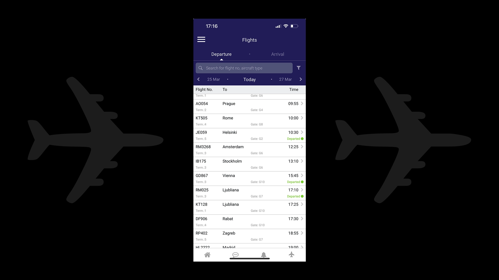
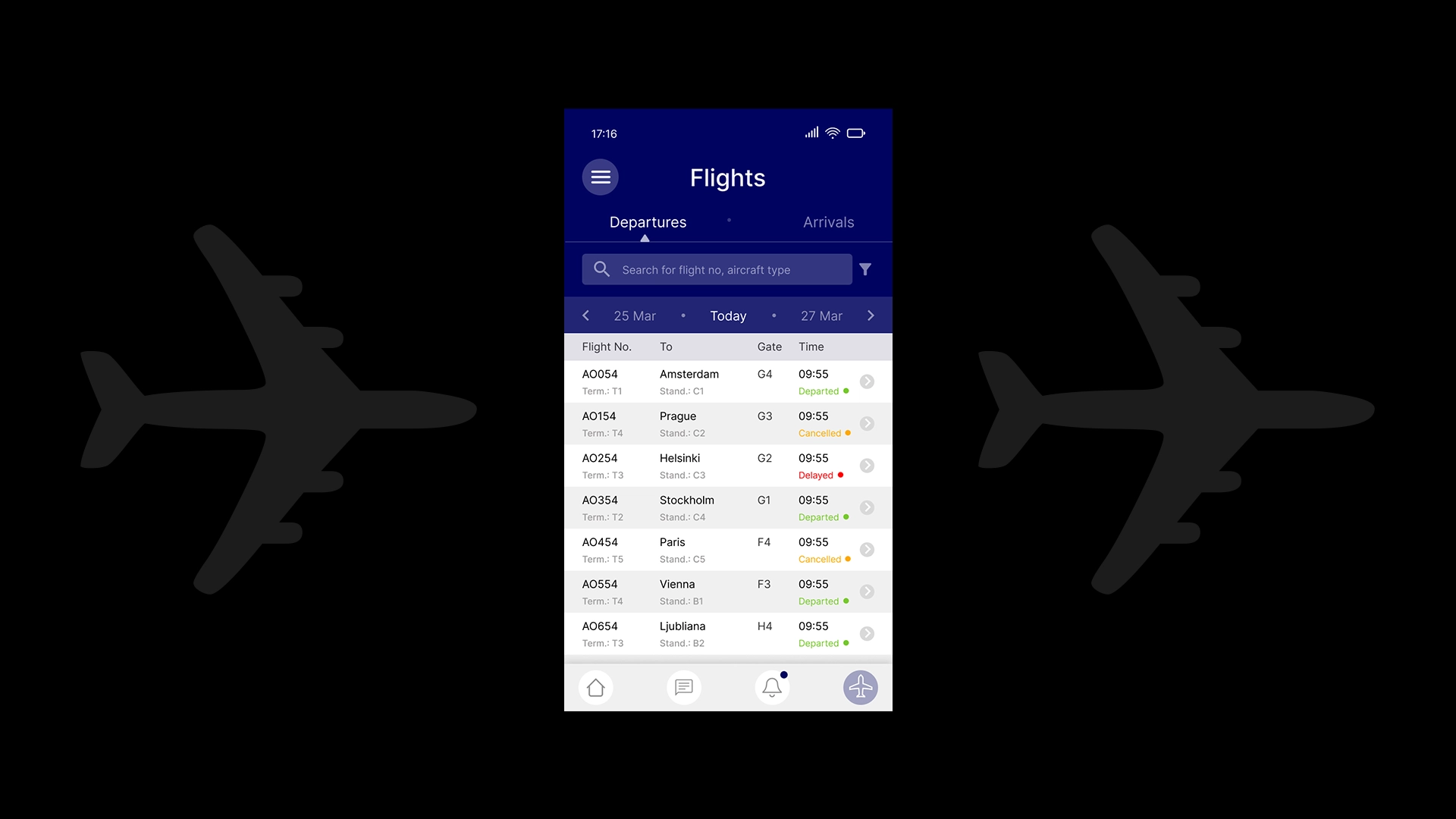
- Flights List: Repetition of labels (e.g., ‘Gate’) reduced scan efficiency, secondary text lacked legibility under bright conditions, and row layouts risked accidental taps. Action icons (from the bottom navigation bar) varied in style (filled vs. outlined).
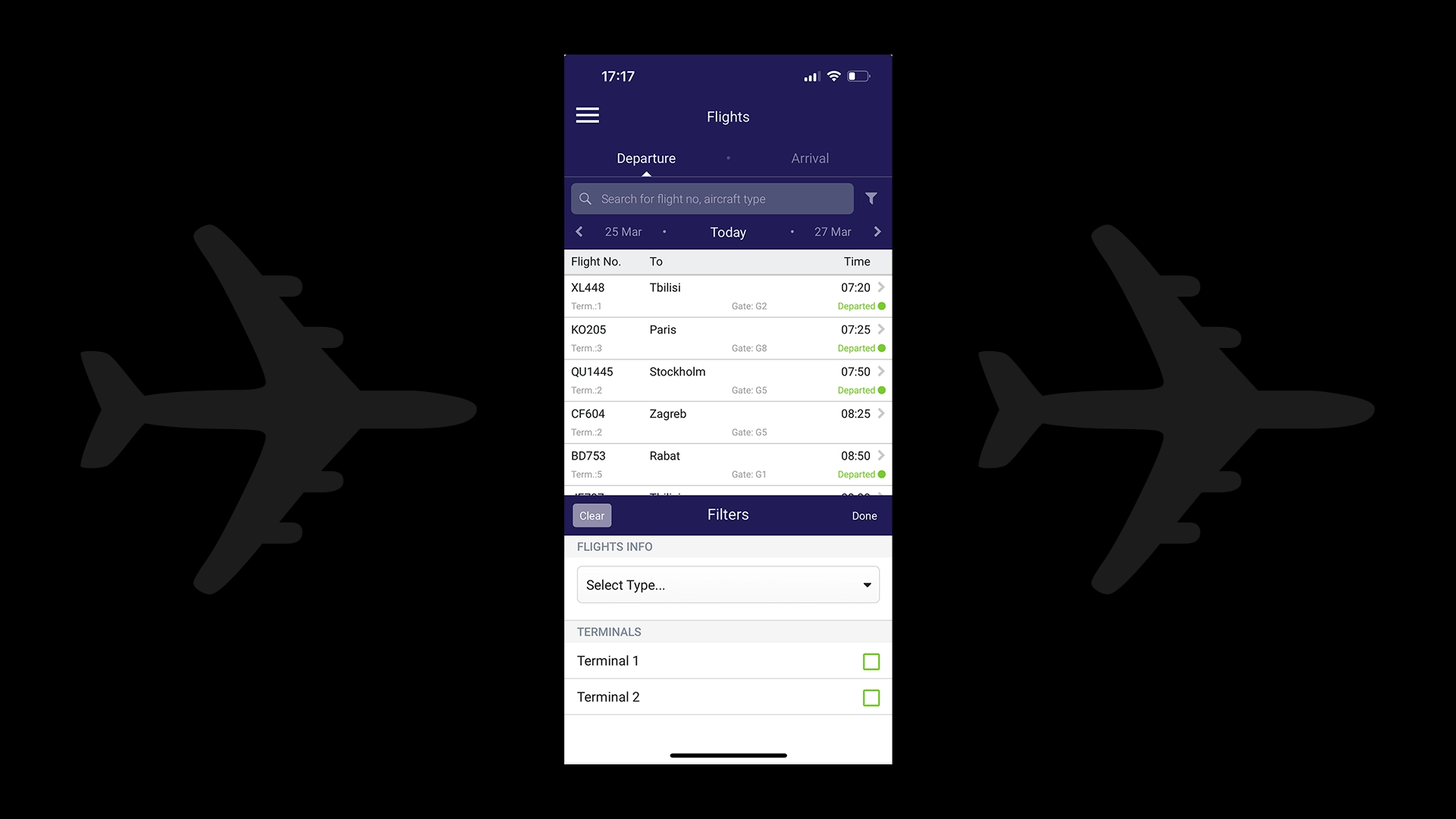
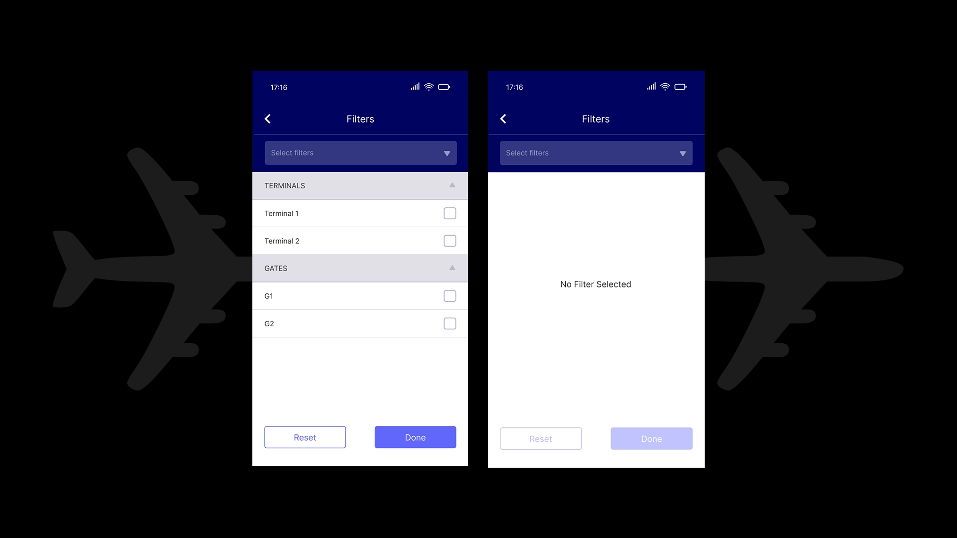
- Filters: The filtering experience was compact and placed primary actions in the middle of the screen, reducing reachability and comfort. The UI was not optimized for fat-finger interactions, and the structure was not future-proof for potential filtering expansions.
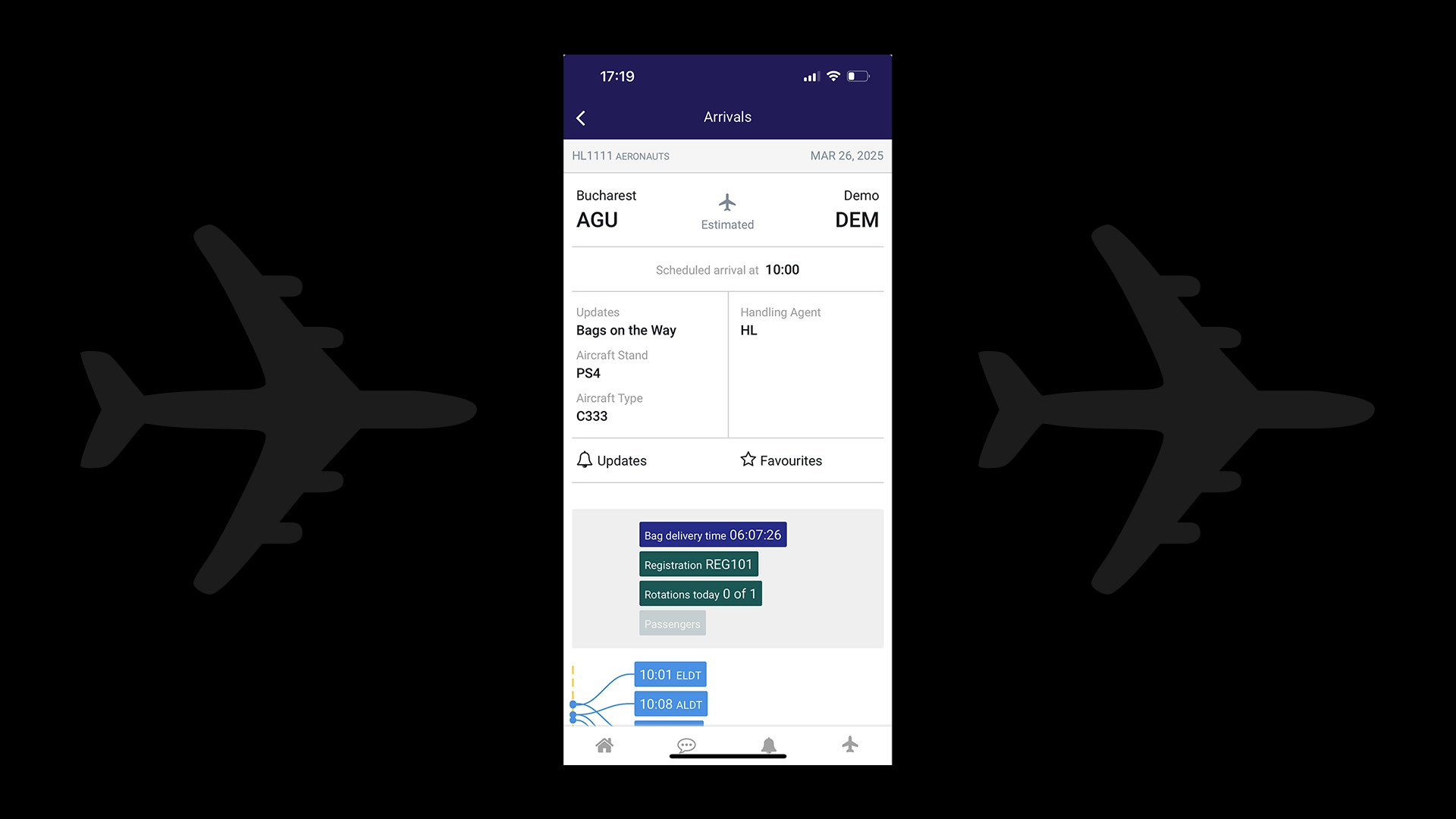
- Flight Details: Screen hierarchy was unclear, using ‘Arrivals’ as the main title. Date formatting was inconsistent throughout the application, and the ‘Updates’ section created confusion, with the notification icon labeled the same- ‘Updates’. A grey block of metrics lacked clear labeling, hinting at interactivity without clarity on its purpose. Also, the lack of a visual flight timeline missed the opportunity to show live flight progress.
These challenges were critical given the users’ needs for speed, clarity, and reliability while operating in high-distraction environments.
SOLUTION
- Flights List
- I introduced a dedicated ‘Gate’ column to remove repetitive labels and improve scan efficiency for users monitoring multiple flights.
- To address legibility in bright airport environments, I increased the font weight of secondary information like ‘Term’ and ‘Stand’ and added alternating row background colors for a clean, modern look that enhances scannability.
- Action chevrons were visually distinguished with a subtle background, making them more clearly tappable, without blending too closely with the ‘Time’ column.
- Margins were increased to reduce edge taps, ensuring accessibility across age groups and hand sizes.
- The bottom bar navigation icons were unified in outline style for a consistent, clean aesthetic, adding an extra touch- the notification dot for the bell icon, highlighting new alerts.
- Filters
- I redesigned the filters as a separate screen, considering the app’s scalability as more filtering criteria may be added over time.
- To improve reachability, I moved the ‘Reset’ and ‘Done’ actions to the bottom of the screen, aligning with ergonomic best practices for mobile use. Filter rows were made taller for fat-finger friendliness, reducing accidental mis-taps in motion-heavy environments.
- The ‘Done’ action was visually prioritized as the primary action to align with the main user goal of applying filters, streamlining the happy path.
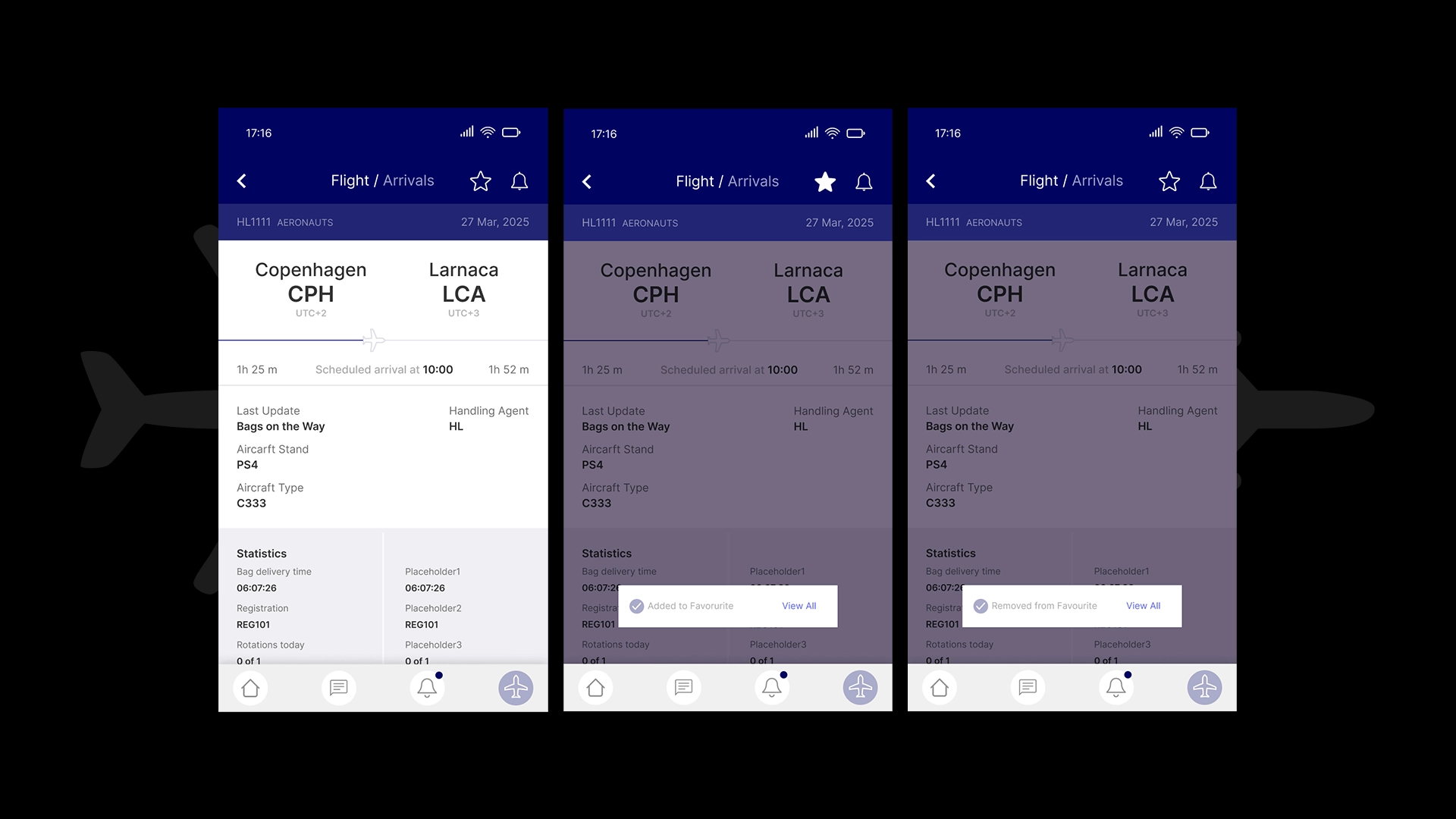
- Flight Details
- I retitled the page to ‘Flight / Arrivals’- instead of ‘Arrivals’, reflecting clear hierarchy as users arrive here from the ‘Flights’ list for viewing specific flight details rather than general arrivals.
- Dates were reformatted consistently across the app to maintain cognitive ease- I removed all-caps styling and aligned it with the rest of the app’s format (day before month).
- The ‘Updates’ and ‘Favourite’ actions were moved to the top header, maintaining visibility at all times without scrolling, and icon labels were removed- they’re widely recognized across most apps and don’t require textual explanation. For better feedback, I made both icons interactive, switching to a filled style when selected, so users get a clear visual indicator when a flight is favorited or notification enabled.
- I renamed the ambiguous ‘Updates’ section to ‘Last Update’ to clarify that it reflects the most recent changes, distinguishing it from the notifications bell icon.
- For the undefined grey metric block, I added the title ‘Statistics’ to clarify its purpose and removed unnecessary background colors to avoid false affordances, maintaining clear plain text until color systems are defined.
- Finally, I added a live visual timeline of the flight route, giving users an immediate sense of the flight’s progress, enhancing understanding and engagement.
Through these refinements, I ensured the AirportLabs app remains a reliable, clear, and accessible tool for stakeholders in dynamic airport environments, balancing visual clarity, scalability, and ergonomic mobile use while aligning with the product’s mission of providing seamless operational awareness.
DELIVERABLES
- mobile app audit & redesign, including a total of 9 screens;
* More details can be provided upon request.
Project details
Project: enterprise, SaaS application
Client: AirportLabs (spec work)
Industry: B2B Aviation
Workplace: my creative cave
Date: 2025
Role: UI/UX designer
Team: solo designer-me 👋
© 2025 Alexandra Petrean. All rights reserved