✴︎ designing a data platform: from MVP to blueprint for growth
CONTEXT
This project was a milestone for me- my first customer-facing project at Fortech (now GlobalLogic Romania). The mission: design the frontend of a cloud-based data analytics platform in the automotive industry.
The core idea was to give users a space to upload hefty datasets (drone videos and metadata), track their processing status, visualize them on an interactive map, and download the results. Sounds simple on paper- but as every UX designer knows, the real story starts where the documentation ends.
CHALLENGE
- Turning ambiguity into action
If there’s one recurring theme in a UX designer’s life, it’s vague requirements. And this project was no exception. Requirements were vague, documentation was scarce, and the client’s vision was still taking shape. My job quickly became part detective, part designer- asking the right questions, digging deeper, and shaping the product direction together with the client.
- Stepping out of the comfort zone
One of the biggest challenges was stepping outside my own comfort zone. As someone a bit on the introverted side, I had to push myself to be proactive, ask the ‘annoying’ questions, and insist on clarifying the gray areas. To make it more interesting, the client also wasn’t the most outgoing person- so building momentum required some persistence.
- Finding flow in the asynchronous
I quickly realized that, like most clients, they were juggling multiple priorities and had limited bandwidth. This meant I needed to adjust how we worked together: moving from expecting long synchronous calls to embracing asynchronous conversations, where I could share questions and progress, and they could respond when their schedule allowed. This rhythm turned out to be more efficient, helping us clarify requirements and evolve the product direction faster than I expected.
- Bridging gaps and building trust
Beyond the design work itself, I became a direct facilitator between the client and the team. Our PO was only assigned part-time, and this meant the team often needed extra support in communication and coordination. I stepped in to bridge that gap, helping to facilitate discussions with the client, clarify requirements, and ensure the developers and QAs had what they needed to move forward smoothly.
I translated the evolving requirements into actionable tasks and worked closely with QAs to make sure features were tested with both functionality and user experience in mind. Stepping up in this way- it not only kept the project moving but also strengthened trust within the team.
- Designing for complexity, delivering clarity
On top of that, the platform itself had plenty of complexity to wrestle with: multiple user roles (visitor, user, admin), different job states, and an interactive map where users could select geographic areas, define points of interest (POI), draw polygons (AOI- areas of interest), manage overlapping areas, and access contextual metadata in real time.
- Untangling the contact form logic
The flow I sketched for the contact form, which breaks down into different branches and experiences, was poorly explained on my part. I should have done a better job of illustrating it visually and with graphics, covering the entire flow rather than just parts of it. The way I explained the flow to the business relied too much on lengthy paragraphs and lacked a clear visual narrative, something that sticks in people’s minds and eases understanding rather than complicating it.
Looking back a year after completing that project, I realize it wasn’t as clear and straightforward as I thought. Even though the final form was really good once I started designing it, the initial idea wasn’t easy for everyone in the business to grasp, and that should have been the case.
SOLUTION
Instead of being paralyzed by ambiguity, I turned it into fuel. With the client, I shaped vague requirements into concrete solutions. With the team- QA, developers, and our PO- I enjoyed one of the best collaborations I’ve had, full of trust and open problem-solving.
- Measurements dashboard with clean tables, color-coded statuses, and estimated times that turned heavy data flows into something easy to follow.
- An interactive map for drawing areas, selecting POIs (points of interest) and AOIs (areas of interest), and also visualizing contextual details instantly.
- A flexible order flow: a dynamic form system that adapts to new and existing clients, with options for uploading supporting files or replacing them with direct map selections.
- Consistent design system: fully aligned with the official frontend kit, ensuring the platform looked and behaved like part of a bigger ecosystem while still being approachable and easy to use.
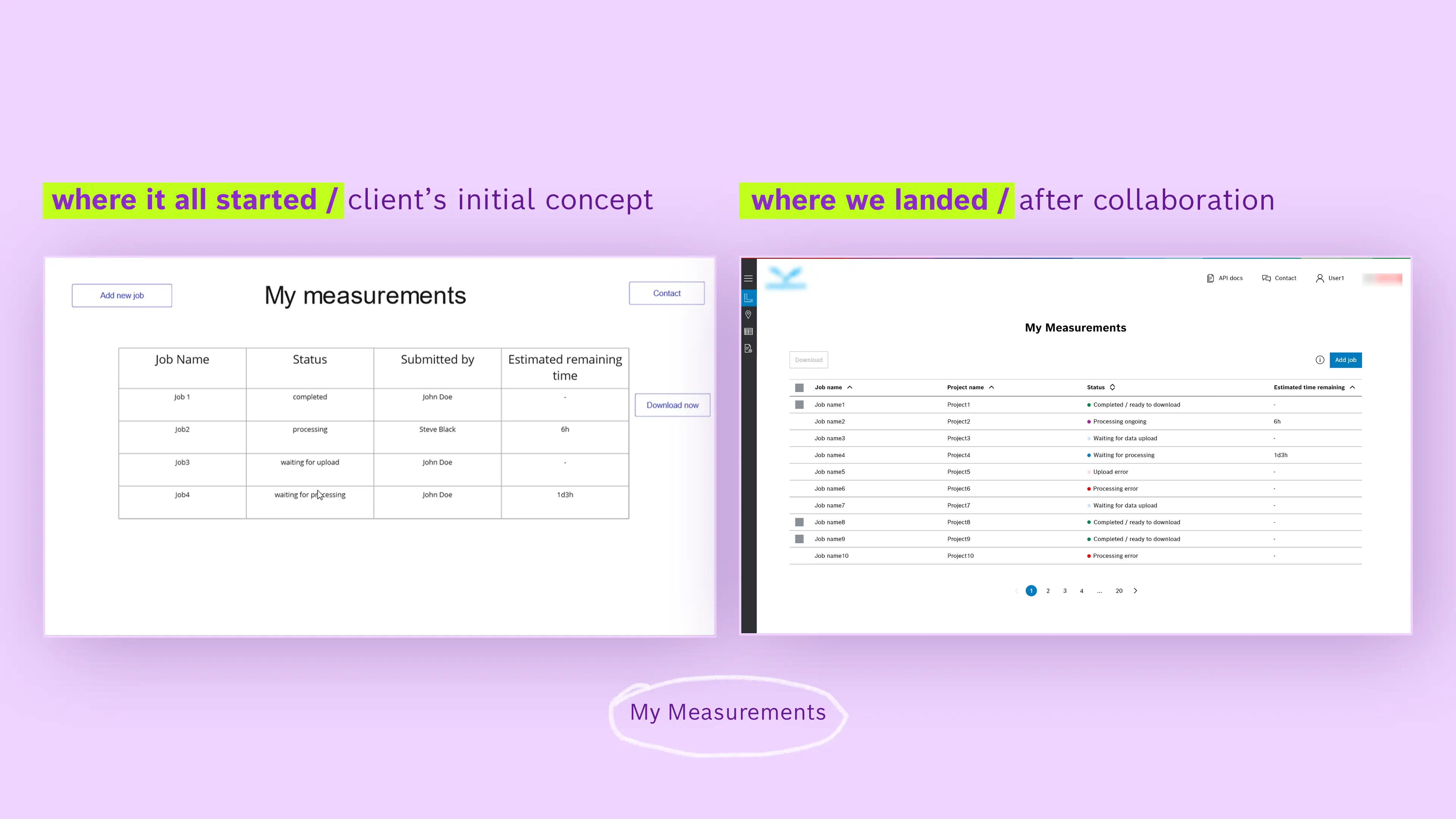
My Measurements
My Measurements page acts as the operational backbone of the platform. It gives users a clear, real-time overview of their data processing jobs, including status, progress, and availability for download. The focus was on clarity and scannability: users can quickly understand what’s happening, what requires action, and what’s ready to use.
It allows users to group jobs under meaningful projects, manage states, and track progress across multiple datasets and stakeholders. From a business perspective, this reduces uncertainty, support requests, and friction in daily workflows. Structurally, the page was designed to scale, accommodating growing datasets, additional job states, and advanced filtering without breaking the core mental model.
The result is a scalable, future-proof design that turned a technically heavy process into an interface where users could focus less on wrestling with complexity and more on making confident, data-driven decisions.
OUTCOME
While the release went live as an MVP, it was much more than a ‘minimum viable product’. We left behind a strong conceptual blueprint that outlined the essential features and ensured the product could grow and bake into the company’s environment over time.
A functional product that was well-received by both the client and the team, and a personal lesson for me: that pushing myself out of my shell and finding new ways to collaborate can make the process not only smoother but more rewarding.
This project remains one of my favorite experiences- largely because of the team I worked with. They were fully responsive, collaborative, and always ready to support each other. Their positive feedback and genuine joy of working together with me were incredibly motivating and kept me pushing to deliver my best.
I’ve added some of my colleagues’ feedback below.


DELIVERABLES
- 1 enterprise, web app (desktop), including a total of 41 screens;
* More details can be provided upon request. If you’d like to learn more about the project or discuss my role in detail, feel free to reach out, I’d be happy to share more in a one-on-one conversation.
Project details
Project: enterprise, SaaS application
Client: thoughtfully anonymized • Hungary
Industry: B2B Automotive
Role: UI/UX designer, visual designer
Team: solo designer-me 👋, 1 PO, 4 FE devs, 1 QA
Tools: Adobe XD, Photoshop
Workplace: Fortech (now GlobalLogic Romania)
Date: 2023
© 2023 Alexandra Petrean, Fortech. All rights reserved