✴︎ making Firebolt’s UX as efficient as its engines
CONTEXT
Firebolt is a next-generation cloud data warehouse designed for high-performance analytics at scale. Its mission is to enable sub-second analytics on massive datasets. Firebolt positions itself not just as another data warehouse, but as a high-performance analytics layer for modern, data-intensive products, especially where latency really matters.
What differentiates Firebolt is its engine-based architecture: queries are decoupled from compute engines, allowing teams to spin up multiple engines in parallel, optimize workloads independently, and scale only where needed. In addition, Firebolt supports on-premise deployment, a rare capability in this market.
From a product perspective, Firebolt is powerful and well-positioned. From a UX perspective, however, it shares a common challenge with many Big Data tools: the experience is primarily designed around technical capability, not user confidence. This tension became the foundation of my case study.
I initiated this project as a personal design challenge. I wanted to work on a real, highly technical product- not a conceptual app, not a polished Dribbble shot- but something that lives in the real world, solves real business problems, and is actively used by technical teams. My intention was not to redesign screens for visual polish, but to understand how the product communicates value, supports learning, and guides users through complexity.
I focused specifically on onboarding because Big Data products tend to be intimidating at first contact. Heavy terminology, unfamiliar mental models, steep learning curves, and complex setups can easily overwhelm users. Even technical users benefit from clarity, reassurance, and a sense of progress. In my experience, there is a clear lack of UX care in this space, not because it is impossible, but because it is often deprioritized.
Firebolt’s free trial made onboarding especially interesting to analyze. This is the moment where users decide whether the product is worth their time and effort. Throughout this study, I constantly asked: how can UX help users understand value faster, feel confident earlier, and stay engaged longer?
With Firebolt offering a free trial as a first touchpoint, onboarding becomes a critical moment. This is where users decide whether the product is worth their time and mental effort. Throughout this study, I kept asking myself:
- Can users quickly understand the value?
- Can they get to their ‘aha’ moment fast?
- Do they feel confident, guided, and in control?
- How can UX better support both business goals and user confidence?
CHALLENGE
Understanding a highly technical product
Firebolt sits well outside a typical ‘design-friendly’ environment. The interface is dense with concepts such as engines, queries, roles, permissions, and schemas. To evaluate the experience meaningfully, I needed more than surface-level analysis- I needed to use the product myself and understand how real users think while interacting with it.
Luckily, I had two things going for me:
- A generous trial environment, which allowed me to go through the onboarding flow step by step.
- And a small army of developers in my close circle (behind every flawless project is a developer you were nice to 💛)
I went through the full onboarding flow using Firebolt’s trial environment, step by step. In parallel, I tested the experience with technical users: developer friends who understand Big Data tools, as well as my husband, a full-stack developer, who helped me understand how queries work, how Big Data workflows evolve, and how users judge value in tools like this.
I focused especially on:
- The sign-up and onboarding flow
- Moments of confusion or hesitation
- Questions users asked out loud
- Friction points that slowed them down or broke their confidence
I also listened carefully to:
- Their frustrations
- Their mental models
- Their comparisons with tools like Snowflake, Databricks, BigQuery, and ClickHouse
SOLUTION
A UX & Product Design audit
Instead of aiming for a perfect redesign, I approached this project as a UX audit. My goal was to identify where small, targeted changes could significantly improve onboarding, clarity, and confidence, without altering the product’s core architecture. This approach allowed me to focus on reasoning, prioritization, and impact rather than visual refinement.
Key UX & Product opportunities
A strong emphasis was placed on the onboarding experience, because this is Firebolt’s first and most important conversation with its users, especially during the free trial phase.
The sections below outline the key areas where UX interventions could strengthen both user experience and business outcomes, with each recommendation grounded in a clear ‘why’.
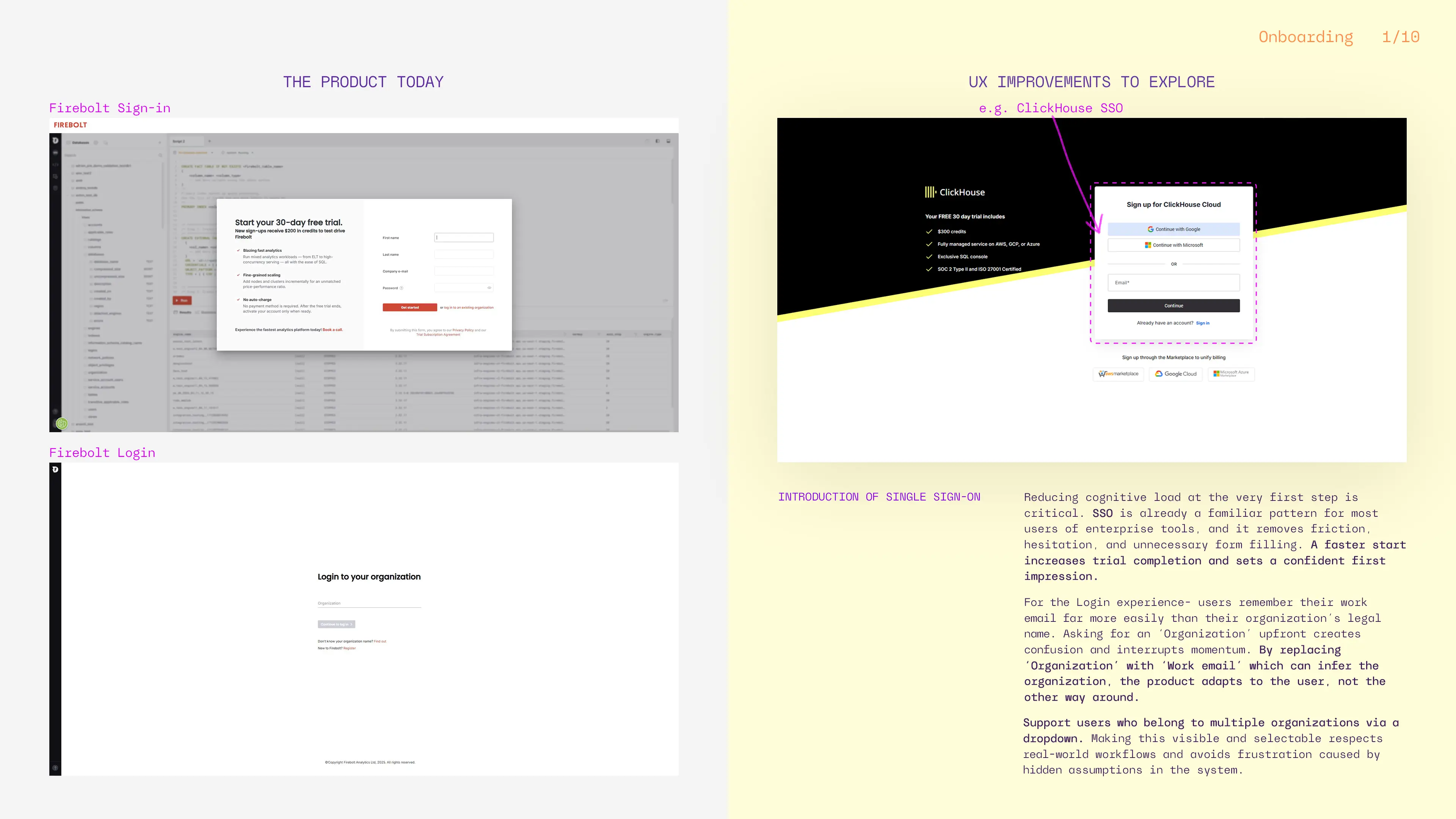
- First touchpoint- authentication dashboard
What ⇢
Introduce Single Sign-On (SSO) via Google or Microsoft and shift to an email-first sign-in/login flow.
Why ⇢
At the very first step, users should not be forced to remember internal or legal organization names. Most users reliably remember their work email, not whether their company is registered as LTD or INC. An email-first approach allows the system to infer the organization automatically, reducing friction and cognitive load. Supporting multiple organization users through a smart dropdown reflects real enterprise workflows and prevents unnecessary confusion, improving efficiency and removing the extra step ‘Don’t know your organization name? Find out’.
- Communicating value early in onboarding
What ⇢
Surface Firebolt’s key differentiators early: on-premise deployment and multiple engines.
Why ⇢
Users decide quickly whether a product is worth their time. Explicitly stating what makes Firebolt different helps users immediately assess relevance and sets expectations before they invest effort.
On premise deployment- among competitors, only ClickHouse also offer this.
The ability to customize the engine running a query- Firebolt separates the engine from the query, offering more flexibility.
What ⇢
Clarify whether ‘Book a Call’ is free and show the duration.
Why ⇢
Ambiguity creates hesitation. Clear pricing and time expectations reduce perceived risk and increase engagement.
What ⇢
Introduce hyperlinks with short videos, webinars, or conference talks during onboarding.
Why ⇢
Complex concepts are often easier to grasp visually than through documentation. Video content helps users build mental models faster, especially in complex, technical products.
What ⇢
Include real user reviews, partner logos, and certifications during onboarding.
Why ⇢
Social proof reduces uncertainty and reassures users that the product is trusted by others like them.
What ⇢
Add a ‘Confirm Password’ field.
Why ⇢
This way you will avoid typos and failed logins later.

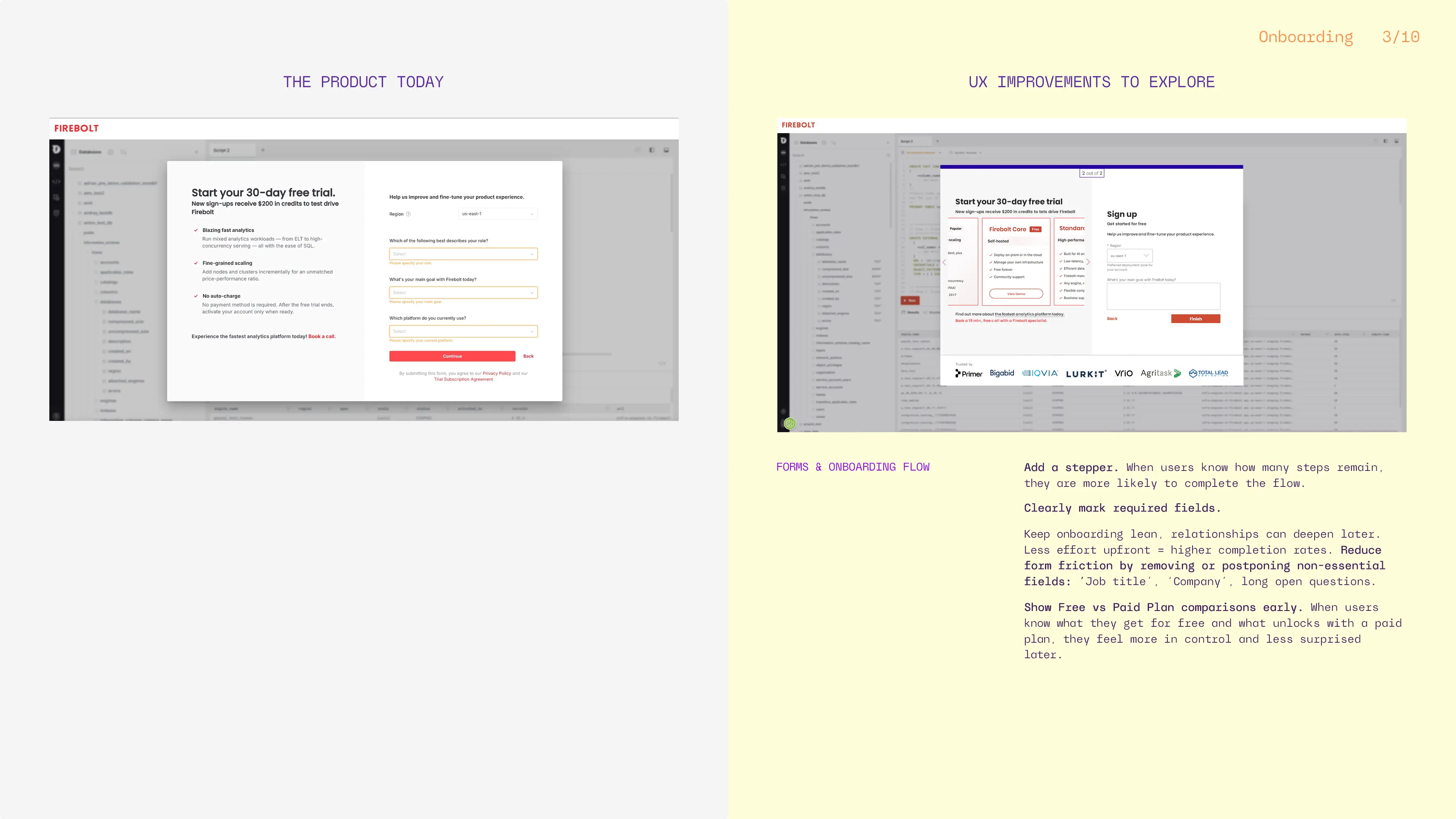
- Form design & flow clarity
What ⇢
Add a stepper to the onboarding flow.
Why ⇢
Progress indicators reduce anxiety and abandonment by clearly showing users where they are and how much effort remains.
What ⇢
Reduce the number of required fields and clearly mark mandatory inputs.
Why ⇢
Each additional field increases drop-off. Early onboarding should prioritize momentum over data collection.
What ⇢
Postpone non-essential questions such as job title or discovery source.
Why ⇢
These inputs benefit the business but not the user at this stage. Prioritizing user momentum over internal data collection leads to better long-term engagement.
What ⇢
Show a Free vs. Paid plan comparison early.
Why ⇢
Transparency builds trust. When users understand limitations upfront, they feel more in control and less frustrated later.
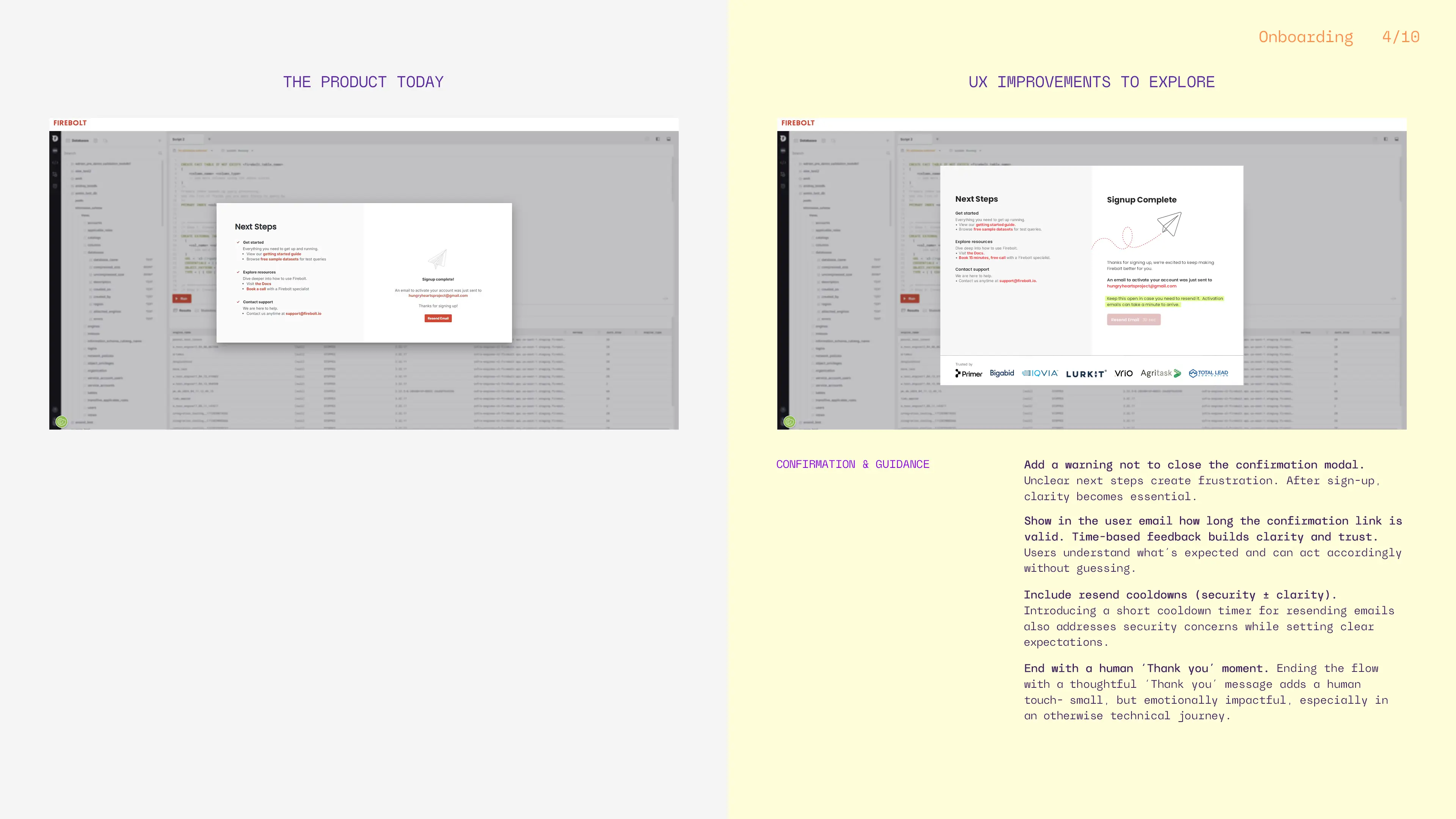
- Confirmation & emotional closure
What ⇢
Clearly guide users through email confirmation with warnings, resend options, and link expiration timing.
Why ⇢
Clear next steps reduce frustration and support issues while increasing user confidence. Users should be clearly warned not to close the confirmation modal until they receive their email, and offered a visible resend option. Showing how long the confirmation link is valid, both on the modal and user’s email, removes uncertainty and prevents frustration.
What ⇢
End the onboarding flow with a human ‘Thank you’ message and maybe an introductory tutorial.
Why ⇢
Small moments of appreciation make the experience feel warmer and more personal, even in a technical product.
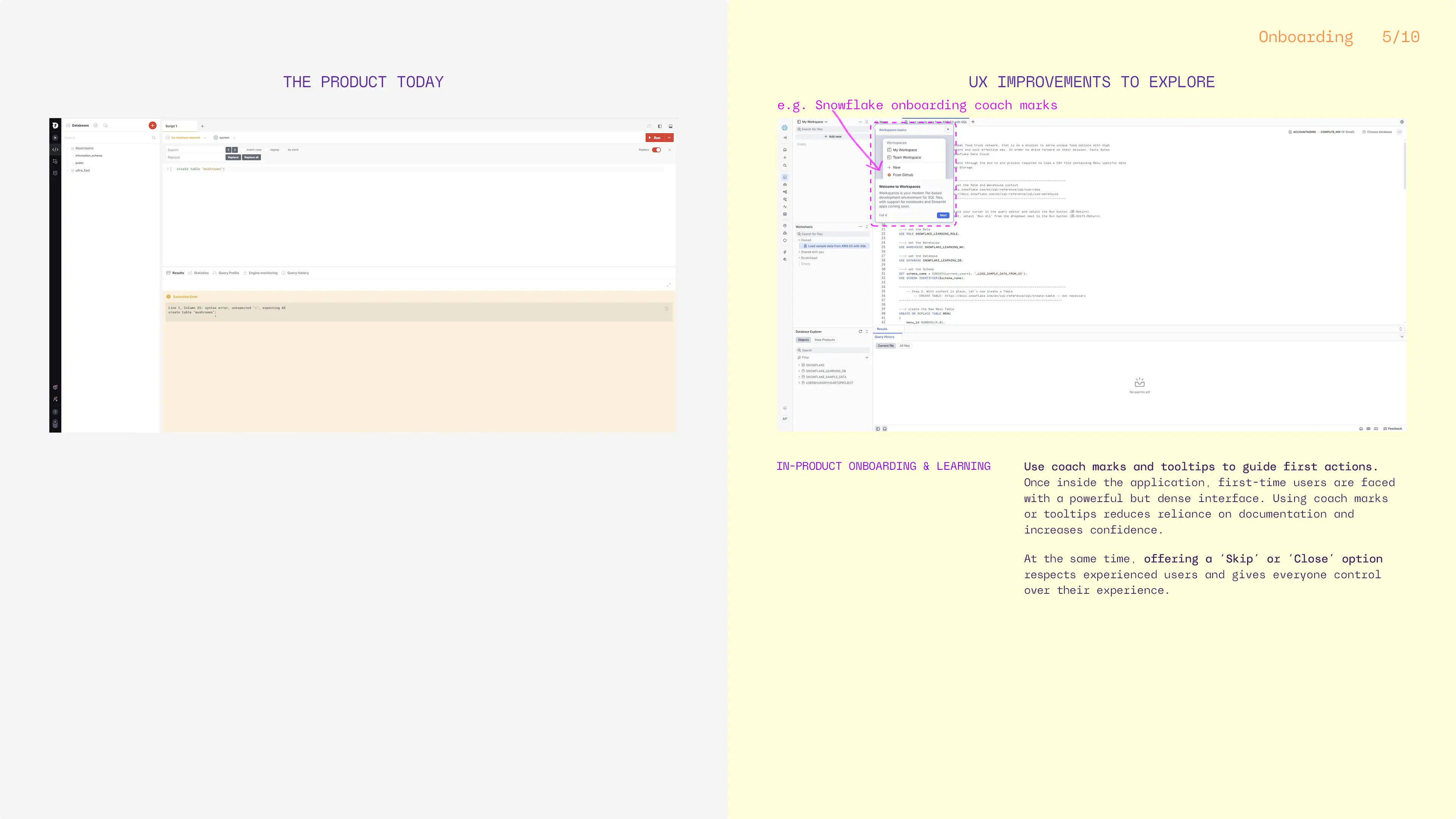
- In-product onboarding
What ⇢
Use coach marks and contextual tooltips to guide first actions like: create a database, create a table, run a query.
Why ⇢
Learning by doing is more effective than reading documentation. Contextual guidance builds confidence without overwhelming users.
What ⇢
Allow users to skip onboarding guidance.
Why ⇢
Experienced users value control and autonomy. Offering a ‘Skip’ or ‘Close’ option respects different experience levels.
- Everyday usability improvements
What ⇢
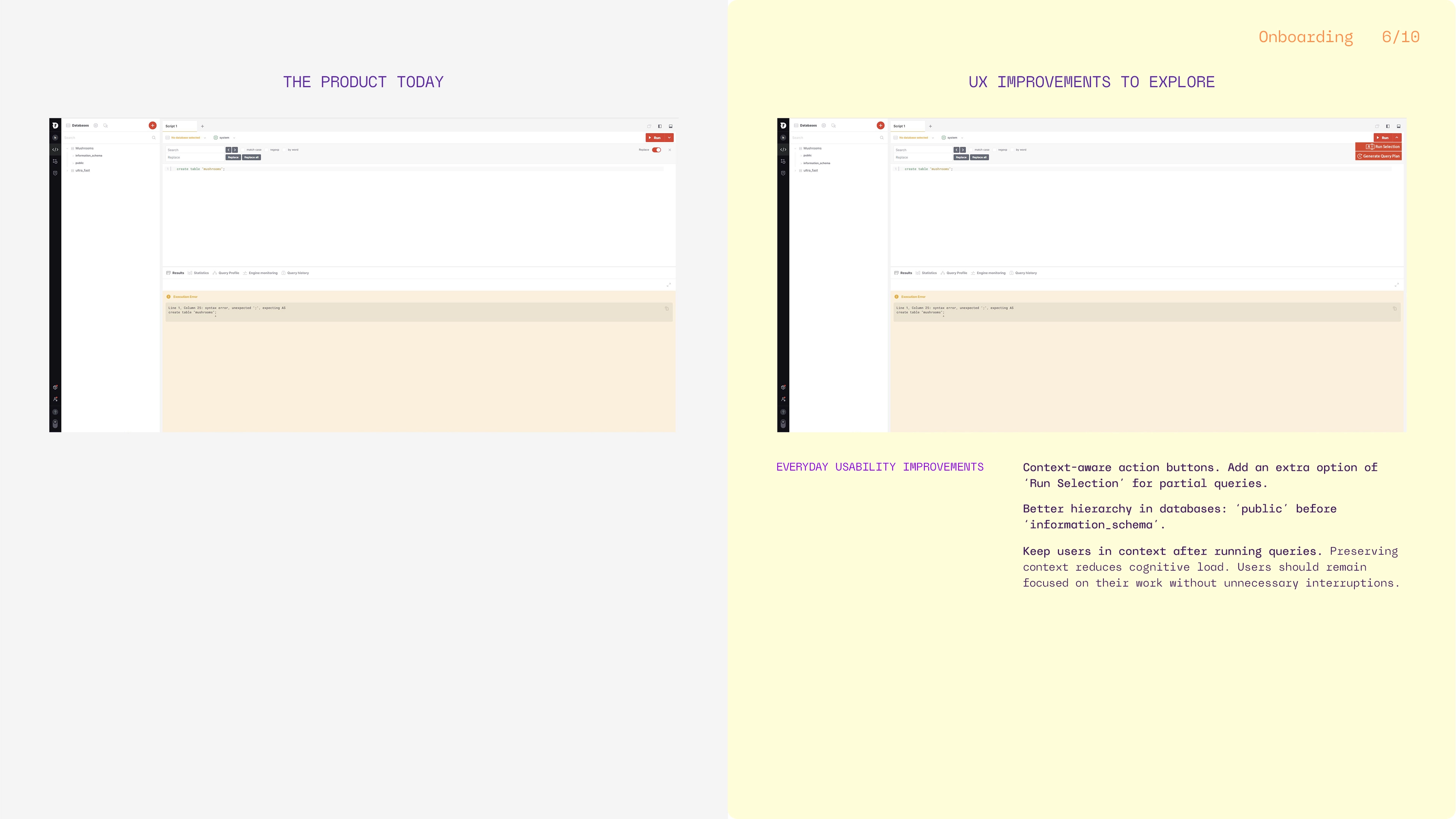
Make action buttons context-aware. Add ‘Run Selection’ for partial queries.
Why ⇢
Users expect actions to relate to their current context. This improves predictability and reduces errors.
What ⇢
Better hierarchy in databases: ‘public’ before ‘information_schema’.
Why ⇢
Prioritizing user-generated data over system metadata in navigation reflects natural task hierarchy.
What ⇢
Keep users in context after the query execution.
Why ⇢
When a user runs a query, the lower panel currently resets to the default ‘Results’ tab, even if another tab (‘Statistics’, ‘Query Profile’, ‘Engine Monitoring’, or ‘Query History’) was previously active. Keeping the user on the same tab they were working in preserves context, reduces cognitive load, and aligns better with user expectations during iterative query work.
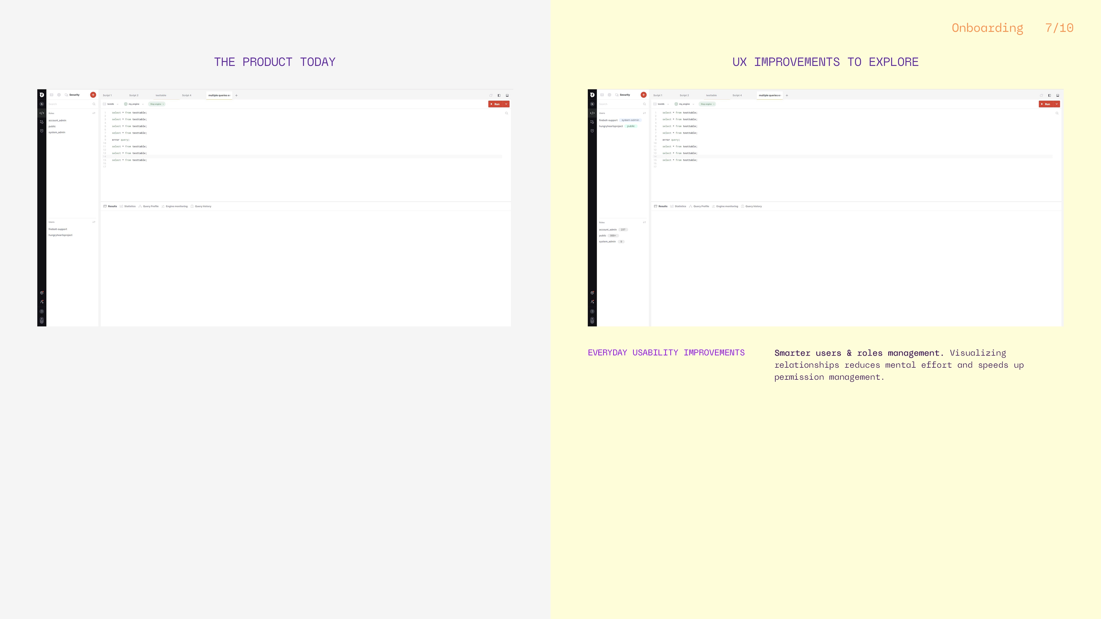
What ⇢
Improve users & roles visibility.
Why ⇢
Based on insights shared by the developers I tested the application with, as well as patterns observed in other complex system management tools where ‘Users’ are typically positioned hierarchically before ‘Roles’, users tend to interact more often with the ‘Users’ section than ‘Roles’, which is why reordering them could better match real workflows. This assumption should be further validated through broader user testing and deeper research to ensure it reflects actual usage patterns.
Making relationships between ‘Users’ and ‘Roles’ more visible helps users understand permissions faster. To make roles and permissions easier to understand at a glance, I introduced lightweight UI components that add context without increasing complexity. ‘Roles’ now surface the number of users assigned to them, with the option to open a scrollable modal showing the people behind each role. This creates a natural path for deeper exploration while keeping the main interface clean.
On the user side, I added ‘Role’ tags to quickly show what permissions each user has. Clicking a role could automatically filter the ‘Users’ section to show only users with that specific role. Also, these tags can evolve into interactive entry points, opening a filtered view of the role and the users associated with it. Together, these changes allow the filter to work interchangeably across users, and roles, making access management more transparent, scalable, and easier to navigate as teams grow.
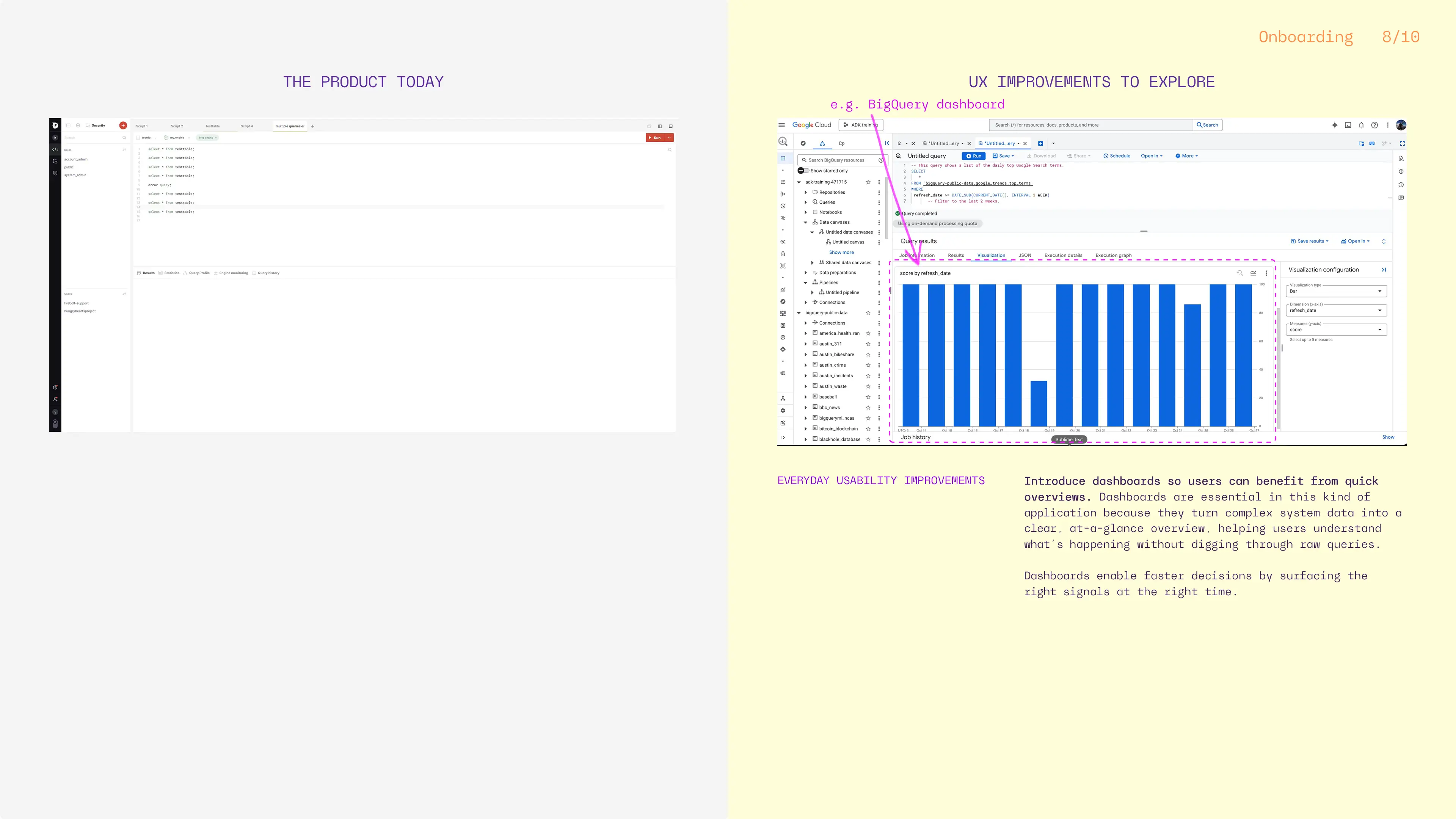
What ⇢
Add dashboards for quick overviews and decision-making.
Why ⇢
Dashboards in analytics platforms like Firebolt are most valuable when they surface data statistics, system health and usage at a glance. While the exact features would need to be validated through user research and testing, common patterns across competitors suggest focusing on signals such as query performance, engine status, active workloads, and cost or resource consumption.
When thoughtfully designed, these visualizations help users quickly spot issues, understand impact, and decide where to act, without leaving their workflow.
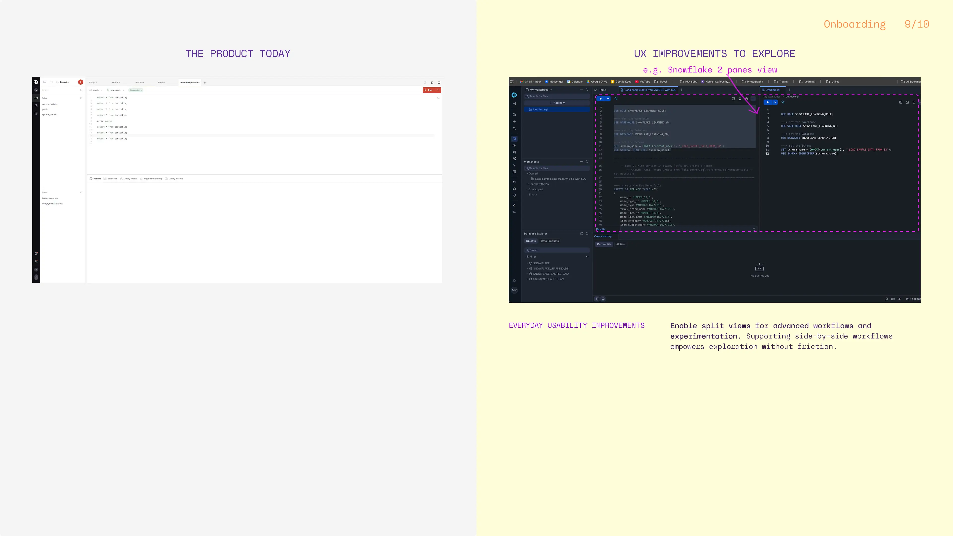
What ⇢
Enable split views for comparing queries or engines.
Why ⇢
Power users often compare queries and experiment. Supporting side-by-side workflows empowers exploration without friction.
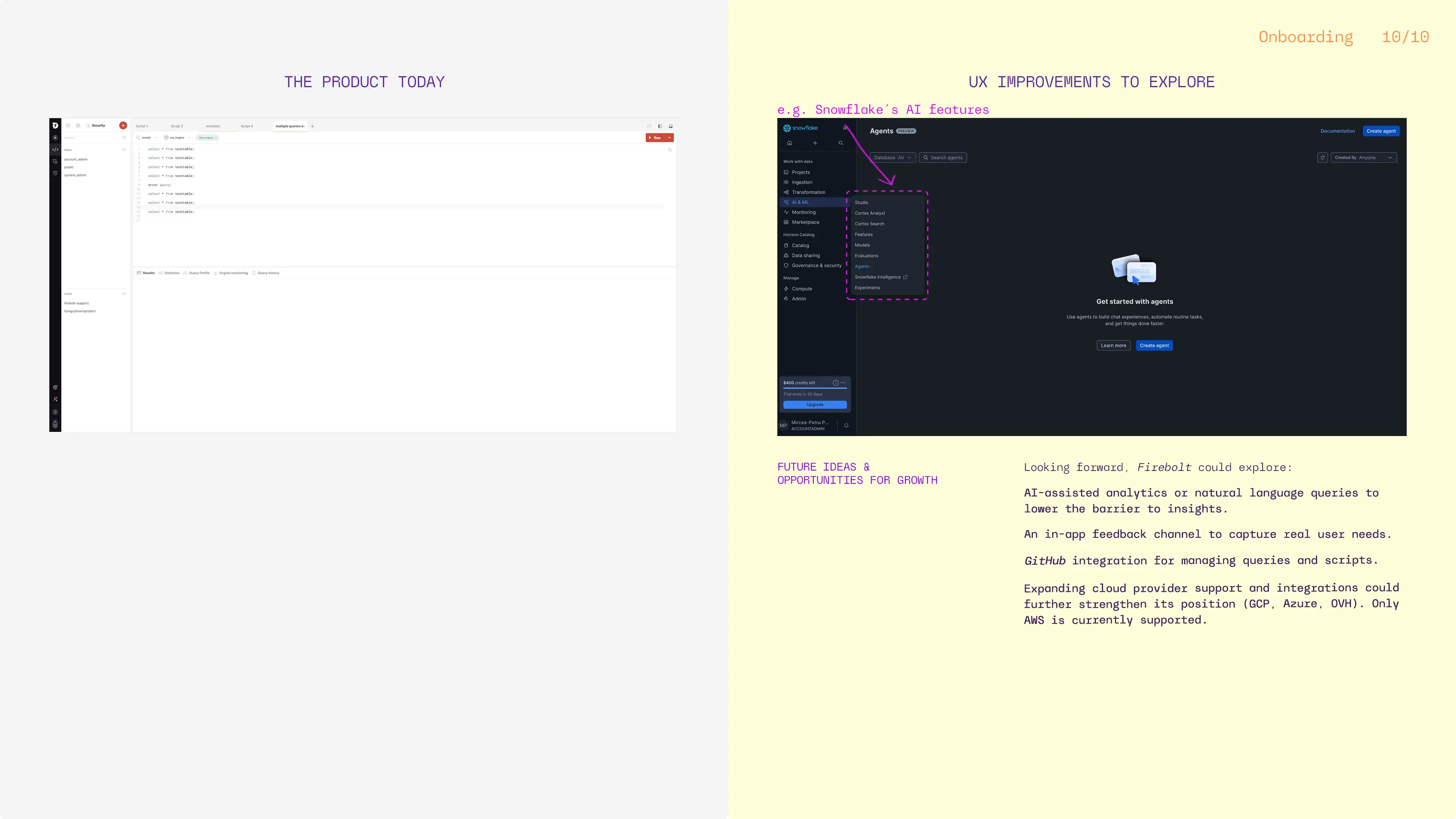
Looking Forward. New ideas & competitive context
Future-facing product ideas:
- Explore AI-assisted analytics or natural language queries. Lowering the barrier to insights makes complex tools more accessible and future-proof.
- In-app feedback channels. Direct feedback loops help products evolve based on real user needs, not assumptions.
- GitHub integration for query and script management. Users value seamless workflows that integrate with tools they already use.
Competitive landscape and opportunities for growth:
- Multi-cloud support (currently only AWS), (GCP, Azure,OVH could be some of them)- many competitors support multiple cloud providers, so diversifying Firebolt‘s cloud provider portfolio could attract more clients who prefer multi-cloud options rather than committing to one.
- More native integrations (currently only AWS S3), (MongoDB, Elasticsearch, MySQL could be some of them)- some products like BigQuery, also offer multiple integrations/ data sources, making it easier for users to import their data.
- Marketplace deployments (currently only AWS Marketplace), (GCP Marketplace, MS Marketplace, could be some of them)- this can improve negotiation leverage and pricing flexibility with cloud providers, making it a plus for the customers. Three way advantages for this approach: Firebolt gains visibility via marketing done by the cloud provider, the cloud provider gains new customers via Firebolt deals, and the last one- the end customer benefits from cost-saving packages deals. Also, this way the customer can optimize the financial process with unified billing.
OUTCOME
This project resulted in a strong, insight-driven case study and helped me sharpen my ability to analyze and design for complex, technical systems. Most importantly, it reinforced a core belief I bring to my work as a product designer: even the most technical products deserve clarity, empathy, and thoughtful user experience.
Also, it helped me:
- Deepen my understanding of Big Data products;
- See onboarding as a strategic business lever;
- And reinforce my belief that UX belongs everywhere, even (and especially) in technical tools;
DELIVERABLES
- 10 audit slides, full of insights & improvements;
* More details can be provided upon request. If you’d like to learn more about the project or discuss my role in detail, feel free to reach out, I’d be happy to share more in a one-on-one conversation.
Project details
Project: enterprise, SaaS application
Client: Firebolt unofficial, but thoughtfully explored • Romania
Industry: B2B Tech, Big Data
Role: UI/UX designer
Team: solo designer-me 👋, sprinkled with developer know-how
Tools: Figma, Adobe Photoshop
Workplace: my creative cave
Date: 2026
© 2026 Alexandra Petrean. All rights reserved