✴︎ designed for when things go wrong
CONTEXT
Every website needs a well-crafted 404 page- not just to handle errors, but to turn a dead-end into a delightful experience. A good 404 page can reduce frustration, keep users engaged, and even add personality to a brand. For this project, the goal was to create a 404 page that wasn’t just a dull error message but an opportunity for interaction and brand expression.
CHALLENGE
Most 404 pages are uninspiring placeholders, causing users to drop off. The challenge was to design a page that felt intentional, engaging, and aligned with the brand’s identity while still being functional. The key was to balance creativity with usability, ensuring users could navigate back seamlessly without feeling lost.
SOLUTION
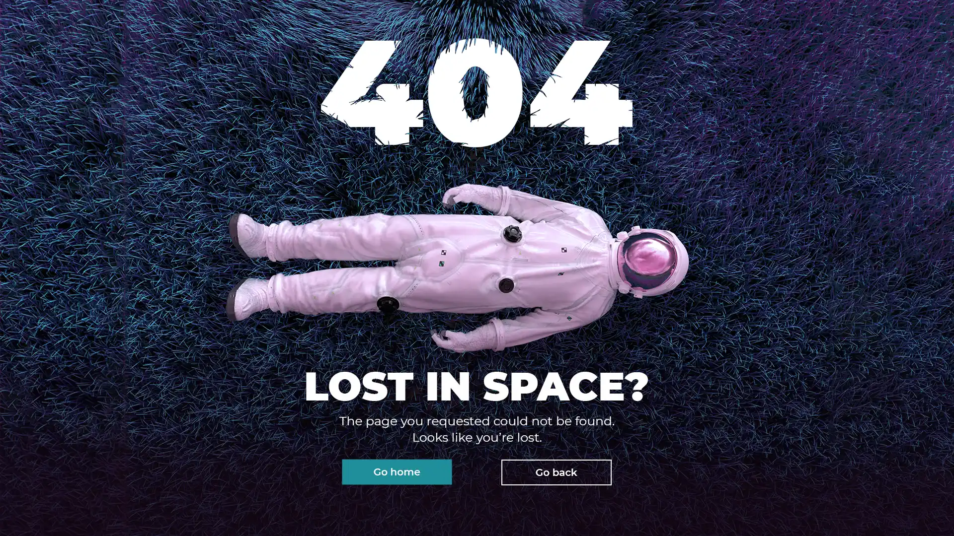
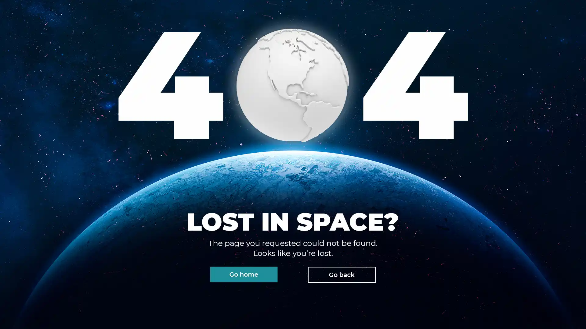
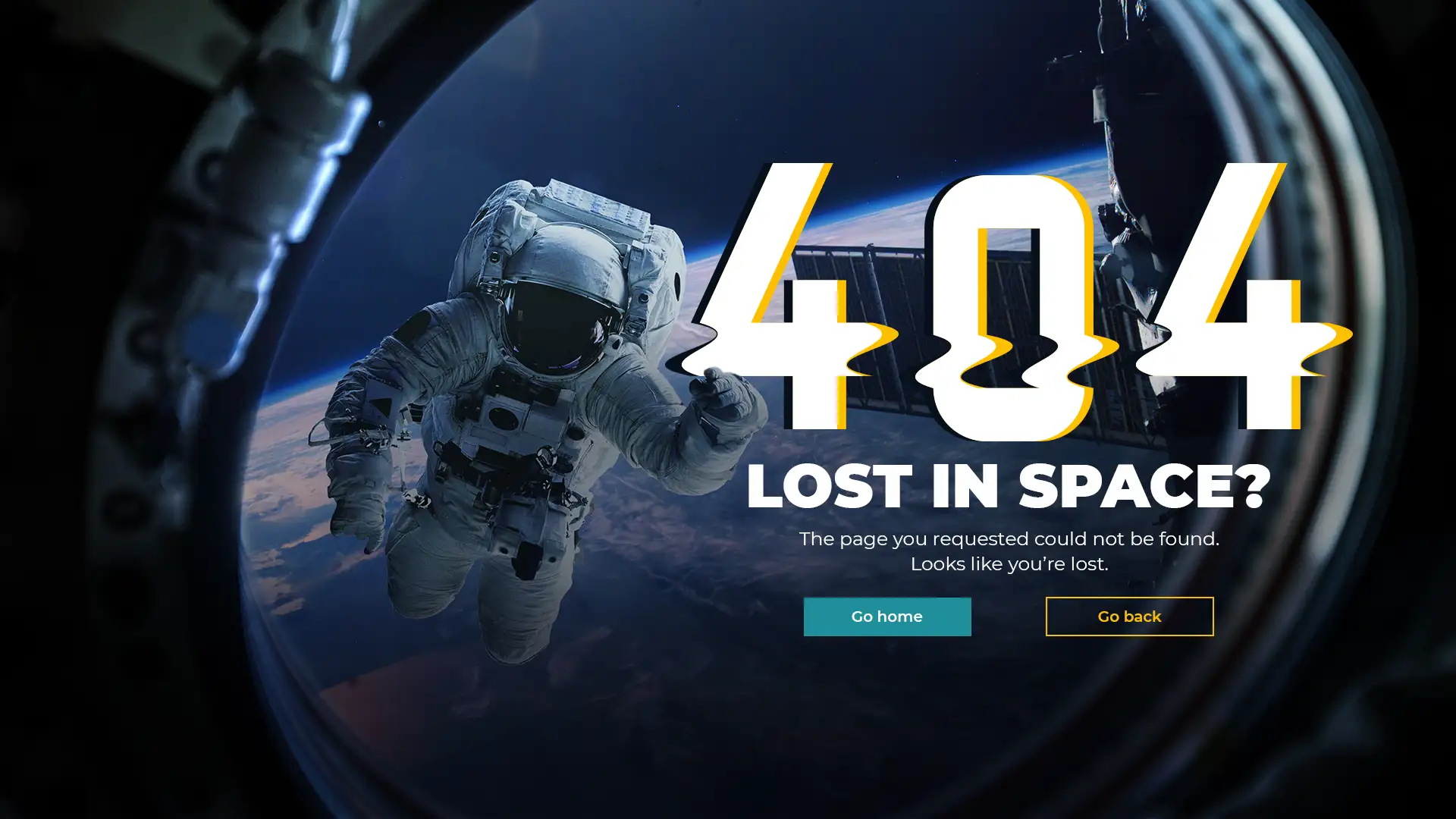
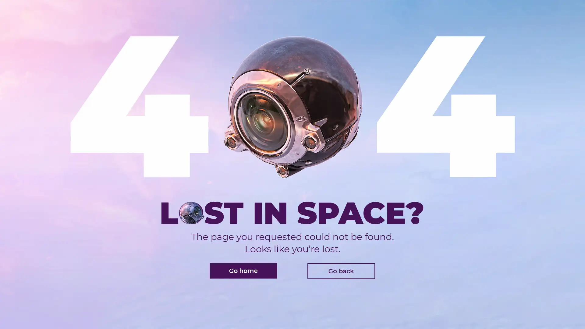
By combining playful visuals, thoughtful messaging, and clear navigation, I transformed a standard 404 page into a branded experience. The design keeps things lighthearted yet functional, using intuitive calls to action to guide users back on track. The result? A page that turns an error into an opportunity.
DELIVERABLES
- 4 web designs;
Project details
Project: website
Client: my inner creative itch • Romania
Industry: B2B Technology
Role: visual designer, UI/UX designer
Team: solo designer-me 👋
Tools: Adobe Illustrator, Photoshop
Workspace: Vohkus
Date: 2021
© 2021 Alexandra Petrean. All rights reserved